Last Updated on November 10, 2022 by Carlos Alonso
It started thousands of years ago and still, it flourishes. Yes, even the ancient Greeks traveled in search of health remedies, kickstarting the medical tourism industry.
While they journeyed to be closer to their gods’ resting places, today’s patients travel for:
– Treatments only available in certain areas
– Remedies that are legalized in specific regions
– Access to advanced treatments found only in developed countries
So, the industry has grown in popularity and globally it is estimated to be USD36.9bn. But just because it’s sought after doesn’t mean your clients will come streaming in. Competition is rife.
So what do the market leaders in medical tourism do to stay at the top?
Let’s analyze some of their tactics and branding methods to help you find new ideas for your next marketing campaign.
Important: Remember that your brand is NOT simply your impressive medical logo and your color scheme. It’s also the value you prioritize such as professionalism or customer care: And don’t forget that who you’re associated with in the market builds—or breaks—your public image. Its a combination of both traditional marketing like printing, direct mail and more digital marketing efforts like design and web.
Which methods will you use to build your brand now?
6 Dynamic Medical Tourism Branding Examples—What Did They Do Right?
World’s Clinic
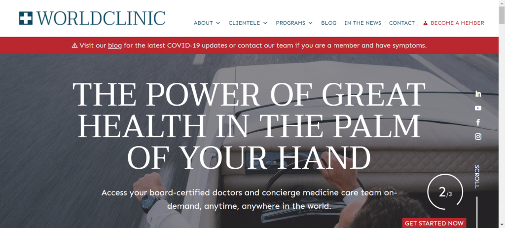
You can see why this entity ranks so high on popularity lists: It managed to use a variety of effective branding marketing methods. As the brand gains popularity, it’s bound to perform well online and move up the search engine rankings.
Firstly World’s Clinic has a remarkably clear and simple logo design. Remember that not all consumers even know about medical tourism. This image shows the well-known globe often associated with travel and the stethoscope makes it clear you can go anywhere in the world…for medical reasons.
If you’re still unsure the brand proves its affinity for being helpful as all its platforms—such as this website home page—provide helpful features. On this page, you even have live chat which enforces their customer-centered.
Color scheme is another powerful tool which this brand used effectively:
– Blue: It’s a powerful color, but also calming. You want people to feel at peace with their decisions.
– Red and Orange: These are synonymous with the healthcare industry, while also representing power. Indirectly this brand is showing its dominance in the market.
Lastly, by using faces in various parts of their branding material they use the dynamic method of drawing consumers’ attention: Using other people’s faces.
Medical Tourism.com
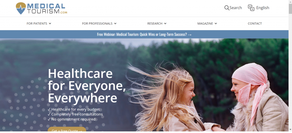
Once again you can see how images of people complement a brand. It draws attention, but it also communicates care for the individual.
Other brand values that are clear in the Medical Tourism.com branding are:
– Giving people options: When someone is ill he or she may feel pushed into a corner, but this brand offers at least some sense of freedom thanks to the many options. You find it easy to navigate to the information and options you need. Options are also mentioned in the text. Since people often take a long time to decide on travel details you must engage with them throughout their thought process. Emphasizing the benefits of options is an excellent method to keep them coming back, as you’re giving information but also freedom to explore their options. The importance of having options is even mentioned in the slogan “Your Passport to a World of Options.”.
– Budget friendly approach: Many services are free and the page helps you compare prices. By mentioning aspects that are important to consumers paired with thoughtfulness around cost shows the brand cares about customers’ needs.
This is another brand that uses blue in its branding, creating a calm environment to make very important choices—for some, their lives may depend on it.
Med Retreat
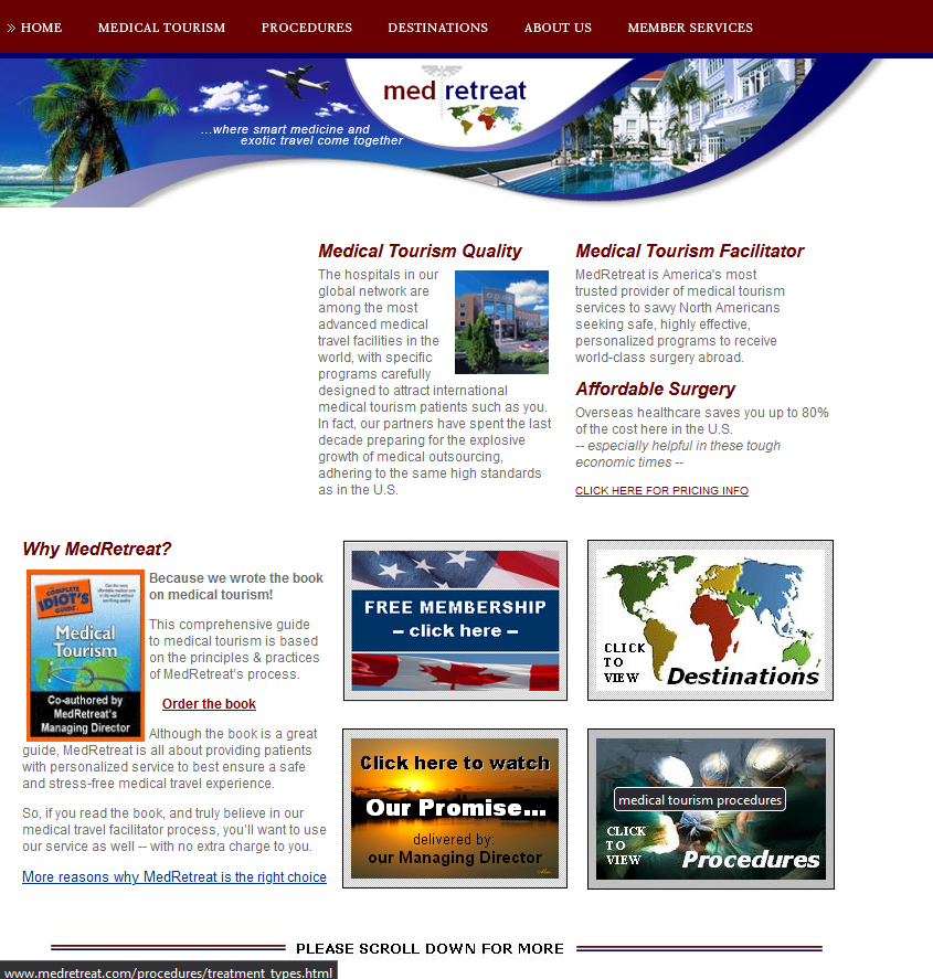
Here is an excellent example of branding that emphasizes a company’s leadership in the industry.
In this example of branding the company doesn’t simply flaunt its tourism products: It clearly showcases its expertise by advertising an insightful book. Being a source of information is an excellent way of communicating the brand value of knowledge: You want to be seen as the company with the skills and know how.
A brilliant logo uses images in a subtle way to communicate a clear, powerful message. This brand cleverly uses the well-known health care symbol that incorporates a staff, snakes and wings. Most people landing on the brand’s marketing material will quickly gauge that this is a unique type of tourism, preventing any misunderstandings.
Via text and images it’s clear the company values quality health care options. However, they realize the importance of making the journey luxurious, resembling regular tourism marketing.
The one thing this brand must work on is website responsiveness to prove that its brand moves with the times.
Medical Tourism Corporation
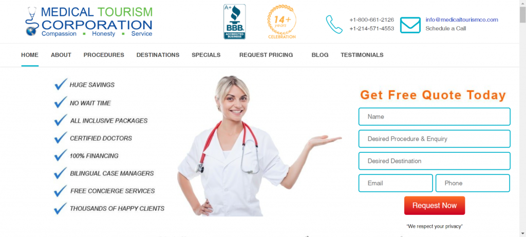
You can see the importance of certain symbols in the medical tourism arena: This brand also uses the image of a globe and a stethoscope in its logo to clearly show its focus is medical tourism.
This is an important aspect in this industry: Consumers may not trust a regular travel agent to have valuable information regarding this niche. Proving that this is your forte—by using relevant images in your logo—helps your audience trust you from the get go.
Take a look at the list of well known publishers and broadcasters mentioned such as CNN. Being associated with the best builds your brand’s prominence and that’s how you spark respect.
Tour My India
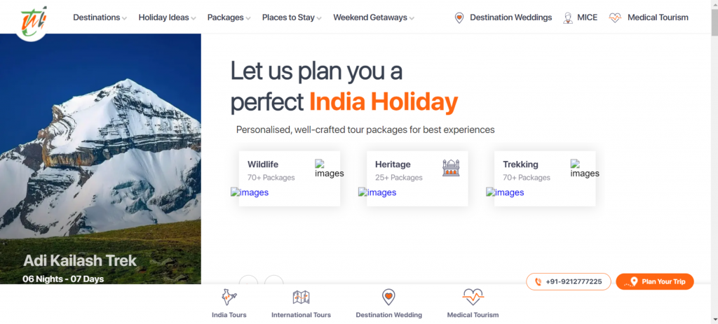
There’s one thing we’ll change about this approach: Stating the name much clearer. The abbreviation doesn’t clarify the brand’s purpose; This is an excellent example of how a logo design can bring you success or limit your growth.
Apart from that, this brand impresses with its user-friendly features, proving that it values customer satisfaction:
– There are many options available.
– It’s simple to browse and find what you’re looking for.
– A free quote helps you manage your budget.
Here’s another brand that uses dark orange; Almost red. This represents caution, but is also bright enough to catch attention: A clear example of how your design affects your impact in the market.
Final Thoughts
Branding is a process you’ll do throughout the course of your company’s existence. For medical tourism, as the market and preferred treatment options change regularly, you need to confirm to your audience on a regular basis that you’re the ideal service provider.
Which of these companies’ tactics will you use next to drive that message home?


