Last Updated on June 20, 2022 by Carlos Alonso
Did you know that 61% of consumers will buy a product they have seen in a brochure? In the digital marketing age, a traditional publication is unique, and bound to attract attention. But how do you get the design right?
Creating your brochure takes patience, preparation, and practice. Read on as we give eight essential tips for designing business brochures.
1. Know Your Goal
When you create brochures for your business, always go into them with a goal in mind. This allows you to focus on relevant information and images, that get your message across.
Are you trying to showcase a new product line? Are you using it to provide examples of previous work you have completed? Or are you just giving an overview of the company and its history?
You should also avoid a brochure that crams multiple objectives into it. This can give a scattered, messy look to the publication. Instead, create smaller brochures to serve different purposes.
2. Prepare Text and Images Beforehand
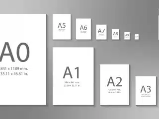
If you prepare your essential images and copy beforehand, it can help gauge the size of the brochure that you need. From here, you can begin to consider headings, fonts, and the general layout.
Try to avoid large blocks of text when planning your design. Smaller paragraphs make it easier for people to read and digest the text. You can also use headings, charts, and bullet points to break it all up.
Should you have any reservations then look at other brochures for reference. If in doubt stick with a minimalist, clean look that favors readability.
3. Know Your Audience
Once you know what you are putting in the brochure, you need to work out who you are writing it for. Luckily, as a business owner, you should know your customers well. Think about the demographic and tailor your design and language to suit them.
Another consideration to make is if you are using it for existing customers, or to attract new ones. If it is aimed at existing customers, you don’t have to give them the background and information about the company. Instead, go straight into driving sales.
When you are attracting new customers, you should use it to build relationships. Less sales language is preferable and you should concentrate on informing them about your company.
4. Consider Your Folds
There are numerous types of brochures, each with slightly different folding designs. You need to consider this, as the fold can impact images and obscure text alignment.
Bifold brochures, for example, have a cover but will obscure the inside. Once opened, the reader can absorb the information before turning to the back.
Trifold brochures are more common in business. The three panels fold together in a concertina shape. Each fold can be used as a separate boundary, or you can run images across them using it as a larger piece.
5. Embrace Space
You don’t have to fill every part of your brochure and should actively try to avoid doing so. By filling everything, the brochure will be cluttered and messy. Information will also be harder for your customers to digest.
Instead, you should consider using space to balance the pages. Have areas that contain lots of information with areas that are sparse and spacious. You could also use color and negative space to add attention to quotes or testimonials.
One other idea is to switch between light and dark backgrounds. This can make it easier for readers by segmenting information types into areas.
6. Make It Flow
Once you have the main elements, make sure your brochure ideas flow neatly across the publication. Text and images should be balanced so that the eye is drawn to the brochure and knows where to go next.
You can use color to assist in this as well. Darker colors should be employed for the headings and text. Lighter colors should be in the images so they add to your copy, and don’t detract from it.
Another technique is to add graphics. They can also direct the reader in a logical flow through your brochure.
7. Invest in Images
It pays to invest in high-quality images. When marketing a company the pictures you use can tell stories the text can not. Therefore it is important to make sure that you spend time and money on them.
Make sure you hire a professional photographer. They will have the right cameras and tools to ensure your products pop on the page. Attempt to match colors and tones to the rest of your brochure design, theming them and tieing them together.
8. Include a CTA
A call to action (CTA) is an instruction to the reader. They are important as they tell the reader what to do next. Without them, they can simply tail off, put the brochure down and forget to follow up.
They can be as simple as telling the reader to visit a website or make a call. However, this technique usually works better when combined with other elements informing them why they should do the command.
For example, you may offer incentives such as sales or discounts. Another idea is to create a sense of urgency by adding limited-time offers.
Get Great Printing for Your Business Brochures
Once you have the design for your business brochures, you just need to find great printing. Don’t cut corners, as poorly made products can destroy a great design. Instead, you should find a company that has a reputation for quality.
For all your printing needs in the Houston area, Catdi should be your first stop. We can print all your promotional materials, as well as provide web design and direct mail services. Visit us here to request an instant quote for your next job.


